The first thing you might notice is that the name of the person who is calling you or you’re calling appears larger on the top of the display (that person and his/her phone number need to be in your Contacts app) and the caller photos will also be larger. The keypad, mute, speaker, and more buttons are no longer round but are oval. When tapped, these buttons change shapes. The answer call button remains a circle.
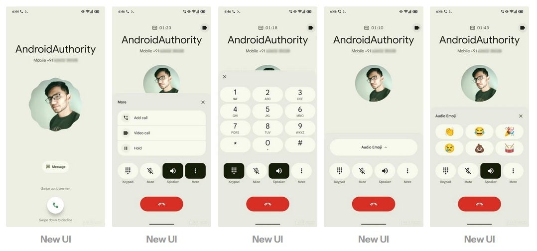
The new look for the Phone by Google Android app. | Image credit-Android Authority
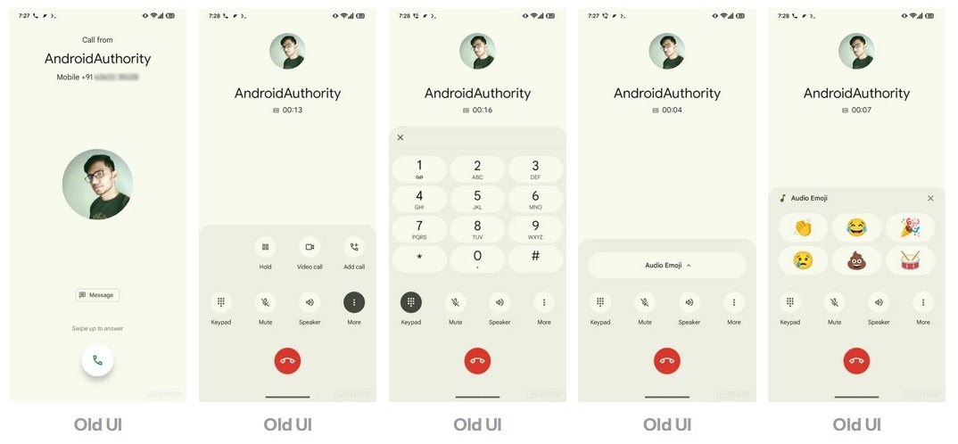
The current look for the Phone by Google Android app. | Image credit-Android Authority
This new look shouldn’t be surprising since Google loves making changes to its native Android apps every now and then. The changes made aren’t earth-shattering but users might find it easier to read the name of the person calling them with the larger-sized text being used. The larger pill-shaped end button should be easier to press when your fingers are fumbling for the red end button and you’re having trouble tapping it cleanly.
This is what Google is all about. Redesigns to apps that seem minor might actually improve an Android user’s experience with the platform.